


Everyone loves new soccer kits – and all 30 teams across Major League Soccer recently released some pretty sharp ones.
Some honor musical tradition (like St. Louis City SC’s homage to Tina Turner, the San Jose Earthquakes‘ tribute to the Grateful Dead, or Sporting Kansas City’s take on the legendary 18th & Vine jazz district). Others lean into their home city’s natural landscape, such as Austin FC or the Seattle Sounders. Others focus on important causes, like CF Montréal’s design that brings awareness to prostate cancer.
– RELATED: All 30 MLS Kits, Explained
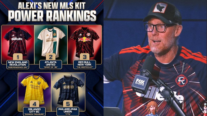
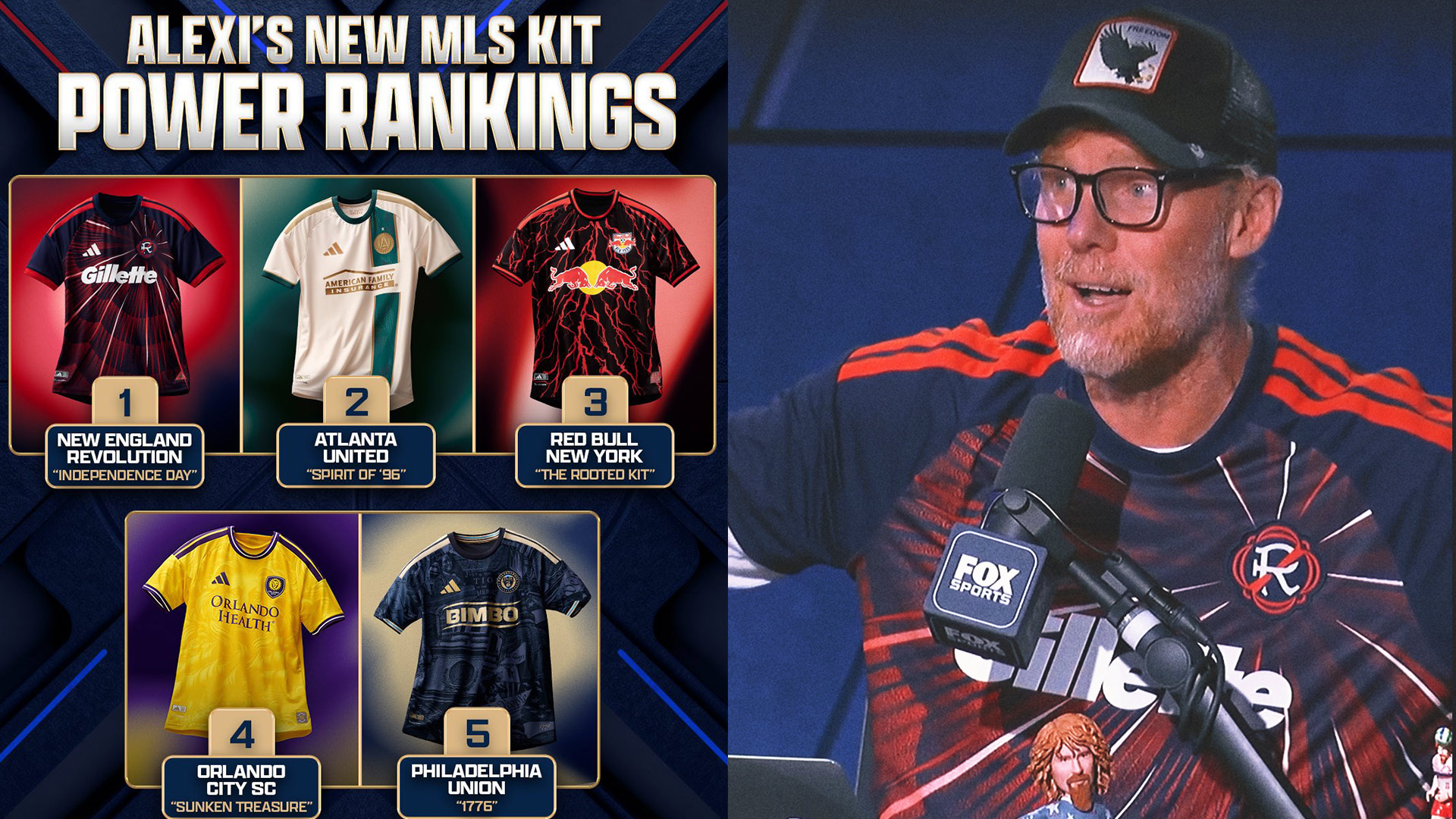
But for Alexi Lalas, FOX Sports soccer analyst and host of the “Alexi Lalas’ State of the Union Podcast”, there are five kits that truly stand out – including the appropriately named “July Fourth Kit” by the New England Revolution. Of course, Lalas played for the Revs – but it’s still a solid selection for the top of his New MLS Kit Power Rankings.
Let’s break down his selections:
5) Philadelphia Union (‘1776’ Kit)

(Major League Soccer)
Details: The kit honors Philadelphia’s role in the 250th anniversary of the United States’ founding and its enduring spirit of rebellion and unity. Inspired by the city’s architecture, documents, and icons that shaped the USA, the design features a “1776” jock tag and the club’s signature “Join or Die” emblem.
Alexi’s Take: “It’s a little understated for me. But you’ll find the Liberty Bell, a dollar bill, the Constitution. It’s very 1776 as the name implies. I would have liked to be a bit more bold. At least they have the respect to recognize the birthday and with the understanding of what they are.”
4) Orlando City SC (‘Sunken Treasure’ Kit)

(Major League Soccer)
Details: Did Orlando strike gold here? The look dives into Florida’s storied coastline and the legend of the 1715 Treasure Fleet. Inspired by shipwrecks and sea exploration, this is the Lions’ first-ever predominantly gold jersey – although the look includes trademark deep purple accents.
Alexi’s Take: “If you look into it, there’s an actual lion that is embedded in the background. I like the color because it pops with this gold, yellow type of thing.”
3) Red Bull New York (‘Rooted’ Kit)
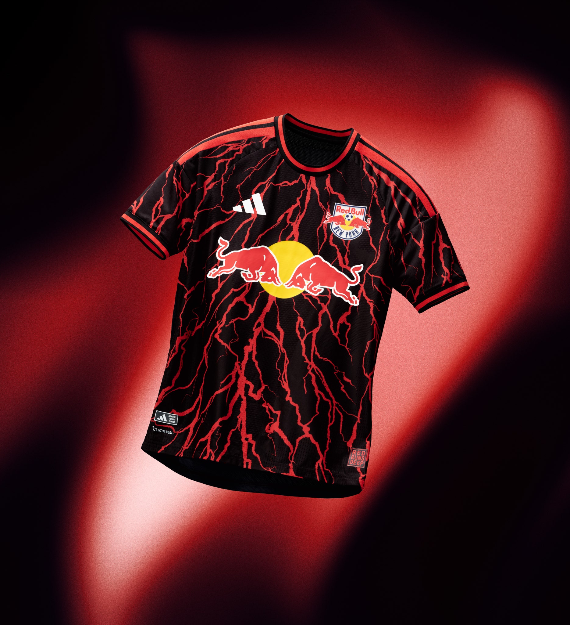
Details: RBNY’s kit reflects the club’s black and red palette with features that symbolize the literal roots and groundwork the team has placed since it was founded as one of the original teams in MLS. A bold look for a new era with former USA captain Michael Bradley returning to the club, this time as manager.
Alexi’s Take: “To me, it just looks like wires and electricity. It’s something different, it’s something instantly recognizable. For me, it screams ‘Hey look at me’ and I want that. I don’t want something understated. I know it’s supposed to be roots, but it looks like veins and lightning.”
2) Atlanta United (‘Spirit of 96’ Kit)
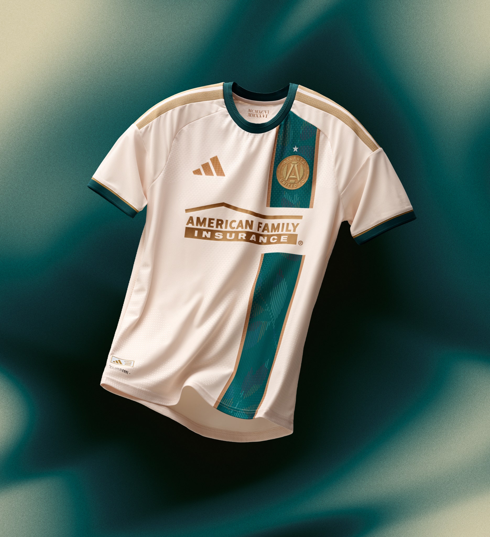
Details: Marking 30 years since Atlanta hosted the Summer Olympics, the design channels that event featuring nostalgic colors and energy, with a gold crest symbolizing victory.
Alexi’s Take: “We talked about 1776 [with Philadelphia’s kit]. In this moment, what Atlanta chose to celebrate is the spirit of ‘96, which was when the Olympics were held in Atlanta. The color scheme and the logo of Atlanta are made to look like a gold medal. It’s a real Olympic reference. I really appreciate that, and it’s just a clean, cool-looking uniform.”
1) New England Revolution (‘Independence Day’ Kit)

(Major League Soccer)
Details: An apt jersey to celebrate America 250. Inspired by patriotic bunting and July 4 fireworks that light the skies each summer, the Revs’ jersey includes Heritage Tree and “Est. 1776” sign-offs. The jersey honors the region’s role in America’s founding and celebrates a milestone year.
Alexi’s Take: “If any team recognized what was in the palm of its hand with the 250th birthday, it would be the New England Revolution. Their jersey is called July Fourth, it is fireworks. It is fire as far as I’m concerned. … Just because you send me something doesn’t mean I’ll wear it, and certainly doesn’t mean it goes to the top of the Power Rankings, but in this case it absolutely did. They didn’t shy away. As a matter of fact, they leaned right into it. They said, ‘You know we’re going to come up with a shirt that celebrates the greatest country in the world.’ That has the color, has the vibrancy, that ultimately has the spark, and the fire that this country deserves on our birthday.”